Context inspires creativity
Five things from this week
Five things from this week . . .
This week has a little bit of a theme: limitations leading to new ideas.
1:
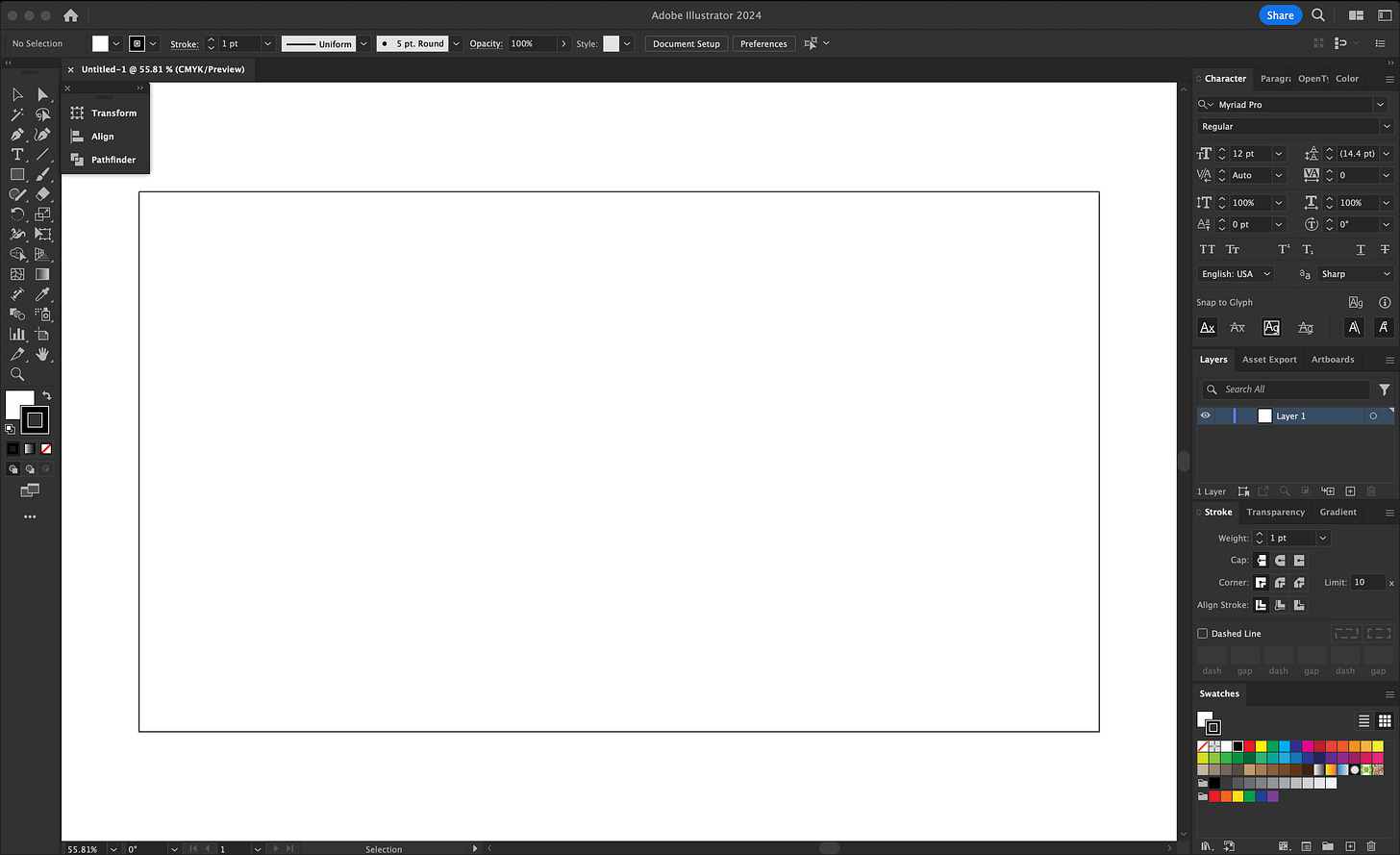
A blank canvas is frequently a stumbling block for me. The empty page contains everything and nothing all at once.
Sometimes I’ll have an idea and excitedly jump on my computer only to find myself staring at “Untitled-1” while all the creative inspiration drains from my body.
There are too many possibilities, too many directions for me to pursue. The amount of decisions I need to make feels daunting. Saying yes to one thing means saying no to a lot of other things. This is paralyzing and I’ll often accept defeat by closing the sketchbook or document.
But lately I’ve been using my sketchbook more than ever and I think it’s because my sketchbook isn’t a sketchbook.
2:
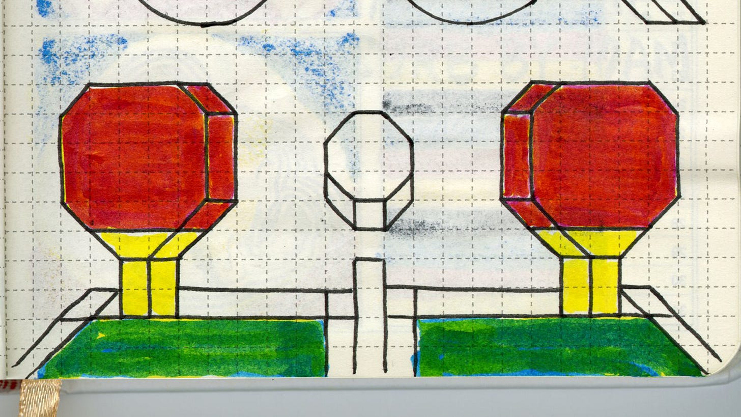
I’m currently drawing in a daily planner. Each page is a little different and gives me a variety of containers and restrictions to work with. Whether it be a calendar, to-do list or a grid, there is always something on the page before I make a mark. These lines and boxes (and dog illustrations?) guide what I make and I happily let myself respond to these arbitrary limitations.
Letting myself be influenced by what’s already on the page gives me somewhere to start. The blank canvas is no longer blank and way less daunting.
This is the first sketchbook I’ve consistently used and I think it’s because I can’t be precious about anything I make inside. There are little black lines running through everything and the paper is cheap so ink and color bleeds from page to page. Every drawing and note is a part of the drawing or note on the page behind it.
Beautiful sketchbooks, journals and notebooks are intimidating. Their perfection makes me feel like I have to make perfect things within them. My wife bought me a set of really nice pocket notebooks and I said, “Thank you! I will never use these.”
Maybe the key to drawing more is thinking less about the end result and more about actually making marks.
3:
Some of my favorite things I’ve made thanks to the guidance of the daily planner . . .
Pixel ping pong
Knox’s Toniebox playing The Laurie Berkner Band.
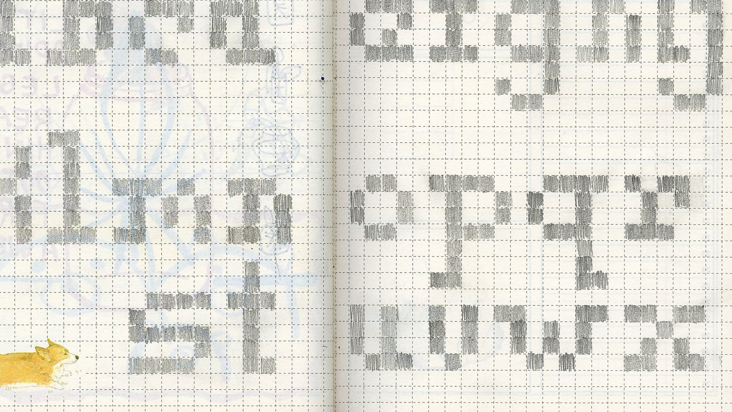
Letters made of squares
4:
I turned those graphite letters into a digital font.
I brought a scan of the drawing into the computer, traced it and added detail, cleaned it up and then removed some squares to make it more interesting. How weird can I make this but still have it be legible?
I increased the x-height (click here to learn typography anatomy) of the letters so everything was as tall as the s and z because I could not figure out how to make those two letters just four pixels high. I also made the counter bigger on all the closed shapes so they didn’t feel so condensed. I tried to use Calligraphr to actually produce the font, but it wasn’t exact enough for what I was trying to do. I moved to FontStruct which was made for building this type of precise, geometric font.
About 15 minutes later I had a font!
Well, all the lowercase letters and some punctuation of a font. I still need to make all the uppercase letters and the rest of the punctuation so it’s actually usable. Maybe I’ll finish it next week so you can download and use it.
5:
Rodney Mullen’s Pop an Ollie and Innovate helped me think about context inspiring creativity in a different way. If you haven’t seen it, this whole TED talk is gold.
At 8:22 in the video is when he starts talking about how different environments (context) inspire different tricks (content). He explains his creative process as getting out of the car, checking for security, then hopping on the skateboard to see how his body will react to this new environment.
He goes up an incline on his skateboard and his body falls forward, so next time he pulls his body back in anticipation of the incline. This body adjustment reminds him of a trick so he combines the incline and trick to create a new trick.
Two ordinary things combine to create a totally new and extraordinary thing.
Whenever I’m feeling stuck or the blank canvas is aggressively staring back at me I remind myself of Rodney Mullen. I don’t have to create something out of thin air. I can combine things I already have (materials, ideas, words, actions, etc.) and let the creative process lead me to discovery.
ALSO:
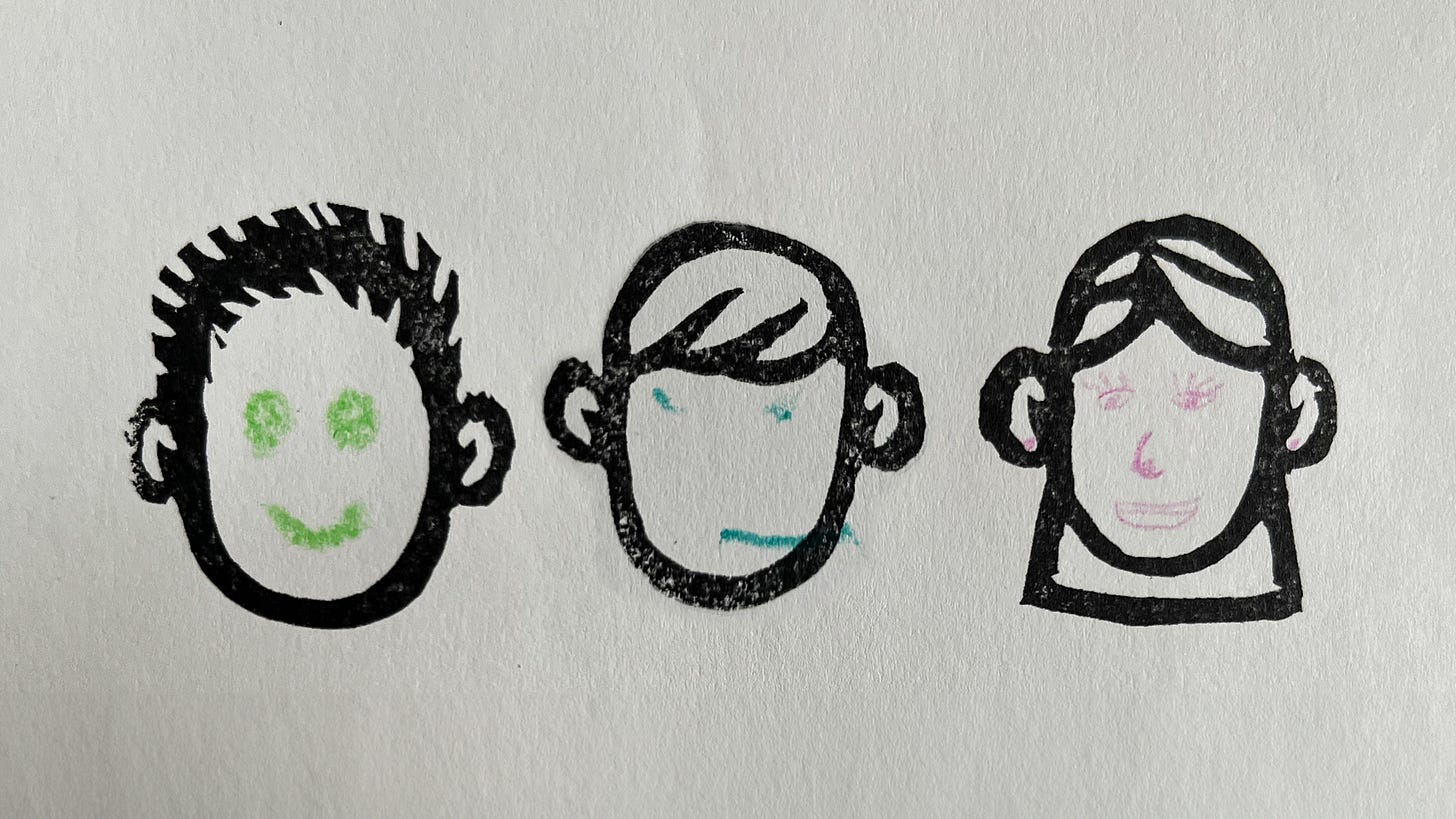
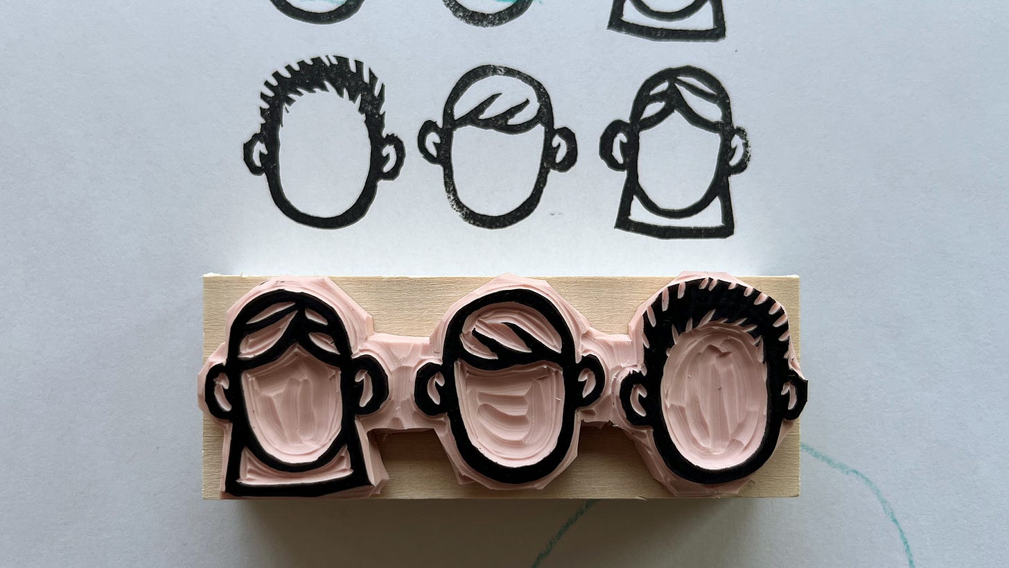
More stamps! I made some blank portraits so we can draw in our own faces.
I also created a YES/NO double-sided stamp.
(standing in the living room with his backpack on) “I’m waiting for the city bus. I’m going to go downtown like dad.”
Thanks for reading! See you next week 👋







WOW! Everything about this is fantastic!! The font is amazing! I distress all my type by hand, but I've never tried to make a font. the day planner art is gorgeous! And the stamps are marvelous! Start to finish this is excellent!
Love so much in this, man! Fully agree that blank pages and fancy journals are terrifying. When I used commercial ones, I preferred those with grid paper. Now I'm making my own and I love how I can customize them to what I need.