


Ionlywannabewithyouuuuhoooo
This week in fragments, links, and tangents
I didn’t make anything for myself this week, but I got some books I’m excited about.
I’ve borrowed Whatcha Mean What’s A Zine? from the library probably seven times so it feels good to finally own it.


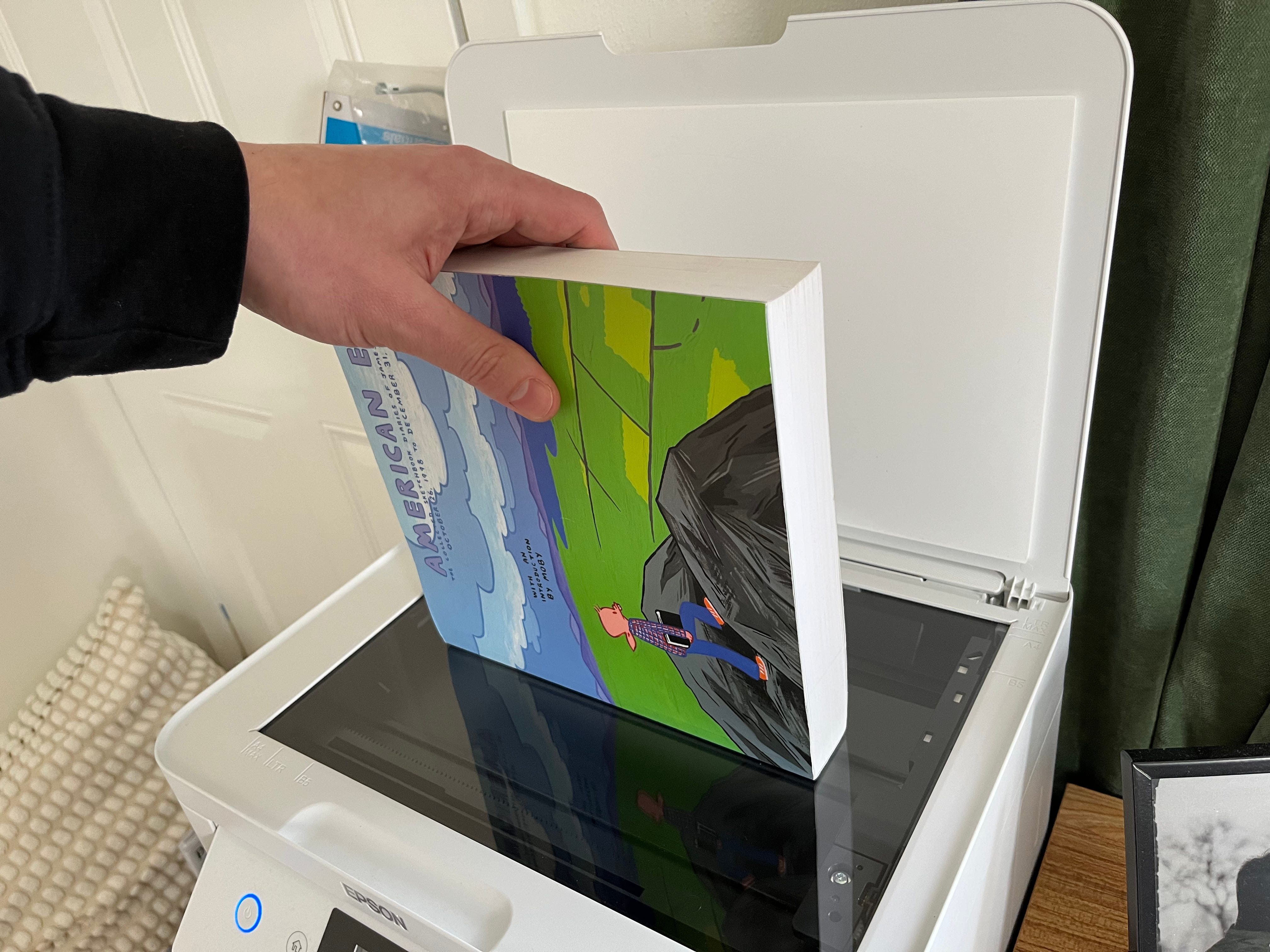
I also got American Elf Volume 1. It’s a thick, square book that contains the collected sketchbook diaries of James Kochalka from October 26, 1998 to December 31, 2003.


I wanted to document the exact condition of my personal copies of these books (for some reason) so I scanned the cover and the spine for the images above. Scanning the cover was easy but scanning the spine required a steady hand.
This week in fragments, links, and tangents:
“The best part of that material, when I look back at it now, is all the in-between stuff of life as it was.” An interview with John Wilson, the creator of How to with John Wilson.
Join the Zinestack Chain Mail Club!
Are.na is where I collect and document ideas. The website is a little hard to explain, so there’s a channel called “How do you describe Are.na at a party?” where you will find responses like “a network of archives and an archive of networks” or “Niche Pinterest or Library Tumblr” or “idea thrift shop.” It’s also run by a small group of people without ads or algorithms. It’s mostly peaceful. Learn more about it here.
Mark Hoppus has a memoir titled Fahrenheit-182 coming out in a few days. I like the Warhol style cover.
“No brushes needed—just cutout shapes, a sponge dipped in printing ink, and some handmade stamps carved from old erasers. It’s a simple yet unique way to create bold, unexpected visuals with endless possibilities.” Cool stenciling technique found via Keep On Rolling.
The highlight of the week was finding a Crosley Fleetwood Radio CD Player at Goodwill for $10. An absolute steal. We also bought Cracked Rear View by Hootie & the Blowfish and have had vowels floating around the house all week.
“The typeface evolves across five weights, each playing with the visibility of the pixel. At the highest resolution, it’s almost invisible, blending seamlessly into the letterforms. As the resolution drops, the pixel becomes more pronounced, revealing its raw, structural nature.” Base Pixel font.
Thanks! See you next week.
“My door is squeaky, did you hear that?” “We need to put sevendy forty on it.”

This newsletter is sent out every Sunday morning, rain or shine. It’s lovingly made by Mitchell and patiently edited by Carly. Knox and Olive are around here somewhere. We do not use AI.
Thank for being here. If you want to support my work you can become a paid subscriber (I’ll occasionally send you things in the mail), buy a zine, share this post with a friend, or hire me to make stuff for you.
That Hoppus cover was designed by Joanne O’Neill who also has this amazing Blink-182 poster series: https://blink182posterproject.com/
You scanned the spines! YES! Why don't more people appreciate the unique art that is spine design? This was such a great post to start off the week for me. Thank you so much.