1: Metamorphosis
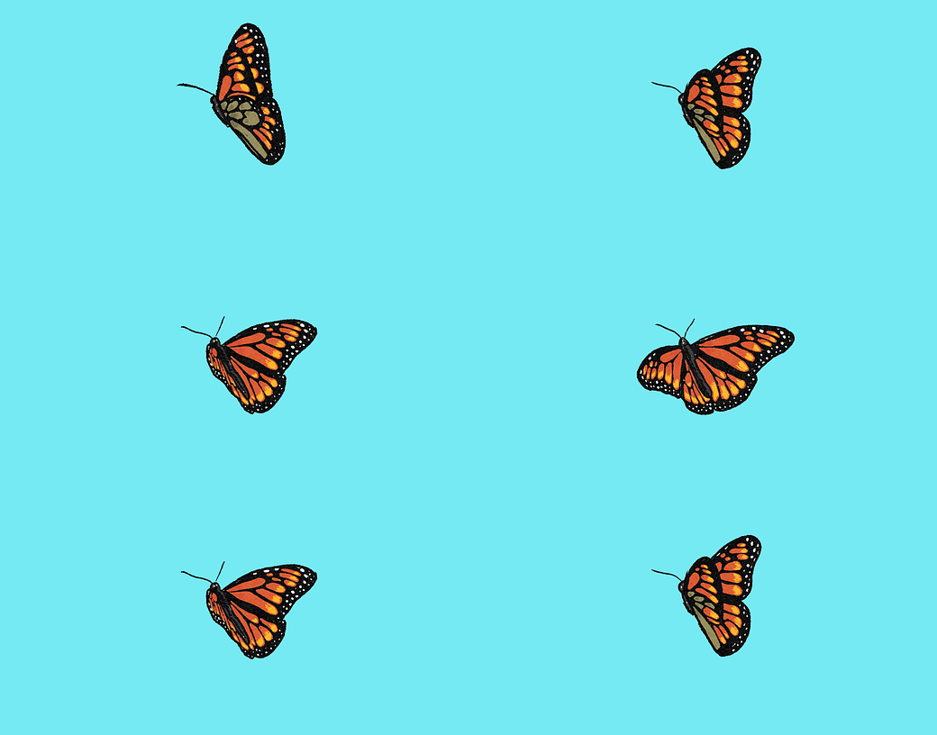
The Isthmus is an independent news source that provides thoughtful coverage on arts, culture, food and politics in Madison, Wisconsin. Each month they ask a local artist to create a cover for their printed publication. A year ago I created this:
If you’re interested in seeing a detailed breakdown of my design process click this link.
The cover is actually an animation . . .
I really love making things that exist digitally and physically, but in different ways that highlight the strengths of the particular medium.
Here are some photos of it being shipped out and at a picnic:
2: Student work
Creating that cover was one of my all-time favorite projects so I turned it into an assignment for my graphic design students. They each picked something they felt represented November, brainstormed concepts, created sketches, refined their ideas digitally and eventually produced a finished cover design.
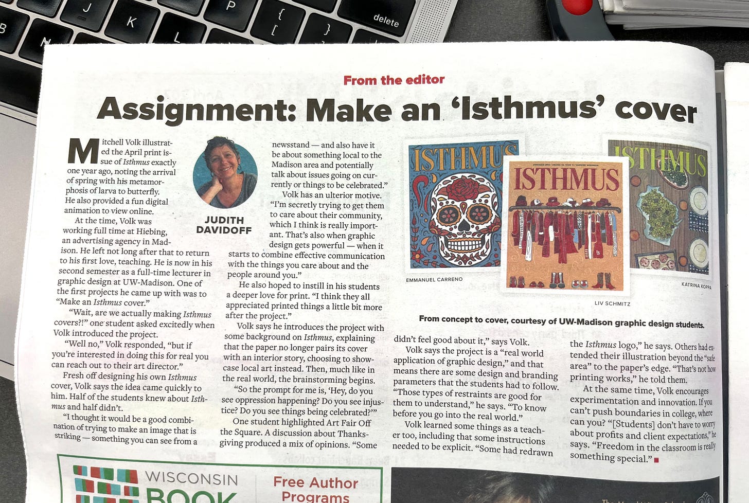
The Isthmus wrote an article about the assignment and featured some student work.
Click here to read the article online.
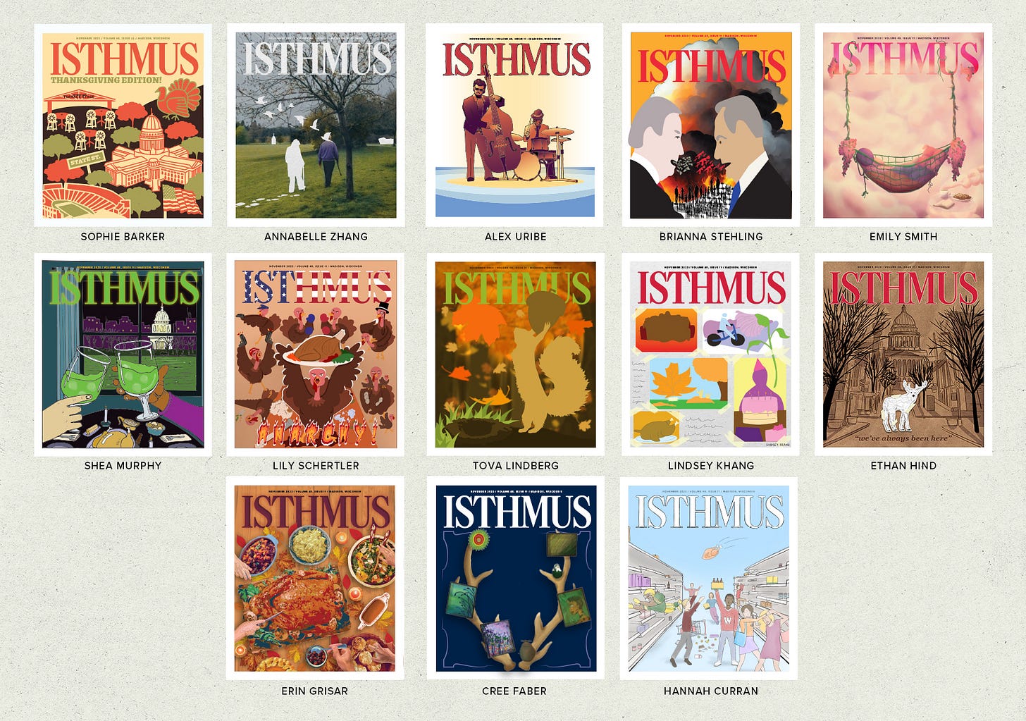
The Isthmus only had so much room to show the work so I've included designs from all the other students in my class last semester. They feature local events, international politics, holiday celebrations, underrepresented people and the seasons changing in Madison.
It's so hard to sum up an entire month in a singular image but they all did it in their own unique way.
3: Type Size Zine
Do you find yourself looking at type and thinking, “I wish I knew the exact size of that type” but have no way to measure it? Have no fear! Type Size Zine is here!
It’s a pocket-sized type guide for all of your type sizing needs. It can also work as a ruler (up to five inches).
The size of SOUR CREAM & ONION on your Pringles can is no longer a mystery. It’s 24 pt!
Type Size Zine can also help you design things that will be printed. What will this 36 pt headline look like from across the room? Now you know!
Eagle-eyed people will notice work by Andy J. Pizza, The Bird Machine, Corita Kent and Princeton Architectural Press.
4: A Room Alive!
Tommasina Capelli (one of Lynda Barry’s former students) made a 30-minute documentary about the UW-Madison comics room. The film was a part of the Wisconsin Film Festival and my wife and I waited in the cold rain to watch it.
You can stay dry and watch it here:
Lynda Barry and Jeff Butler got on stage after the screening to talk a little about the comics room, how it came to be and the magic students continue to find there.
Last month I had the opportunity to spend a couple hours with Lynda Barry in the comics room and wrote about it here:
5: Animated alphabet
I love the work of Anna Mills. The video above is a talk she gave at Nicer Tuesdays a year ago about design and animation.
She talks about wanting to make an ampersand move and how animation began to transform her design process.
Anna makes exploring unfamiliar creative territory seem way less daunting by using tools and knowledge she already has, just in new ways. Animation is a huge, complicated, time intensive thing, but she tiptoes into it by making one letter wiggle.
What’s one letter you could make wiggle this week?
ALSO:
The Trodat Printy 4912 Custom Stamp kit is okay (too hard to change the letters, not a crisp print every time), but the Maxmark Dater 2000 does not miss. 10/10 would recommend.
Dieter Rams: 10 principles of good design (thanks, Brandon)
4,000 of My Closest Friends – Cat and Girl. “I want to make my little thing and put it out in the world and hope that sometimes it means something to somebody else. Without exploiting anyone. And without being exploited. If that’s possible.”
The People’s Graphic Design Archive. Go add something!
Graphic design history, writing and inspiration –
“I’m sick of this.” “No you’re not, I’M sick.”


Where can I download & print my own type size zine? It looks incredible!
I loved this entire poet, but man that type size zine feels life changing! I love it!